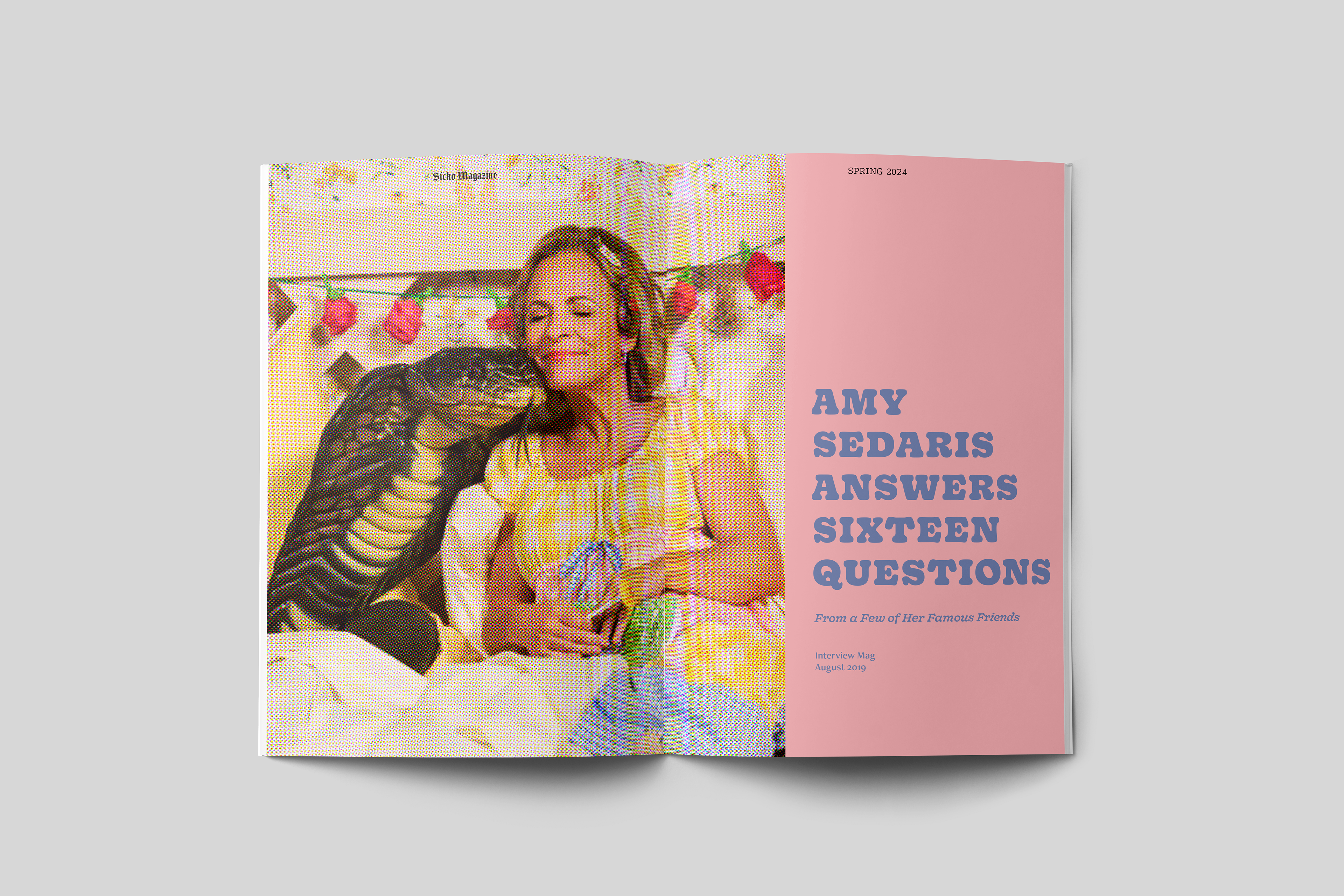
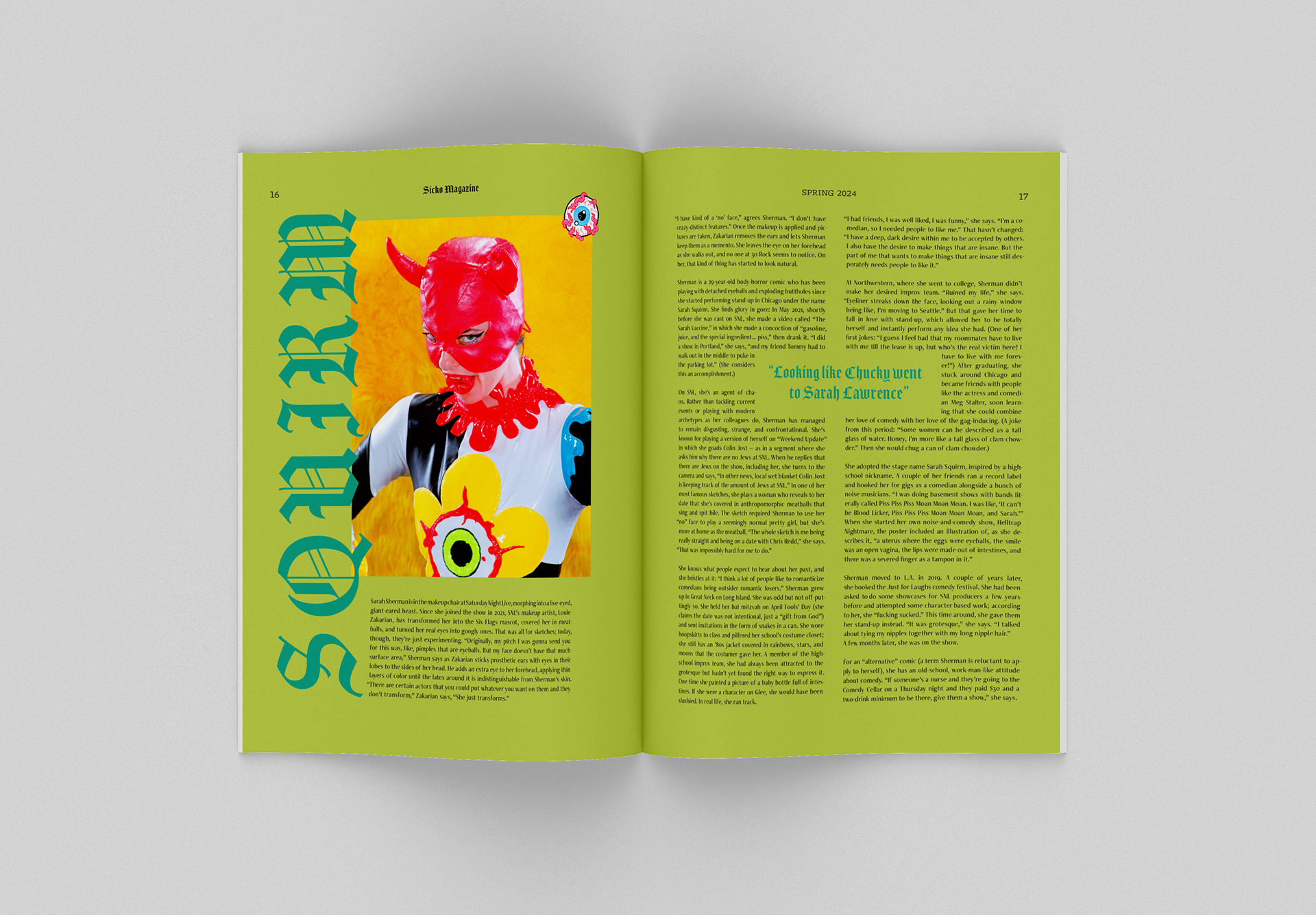
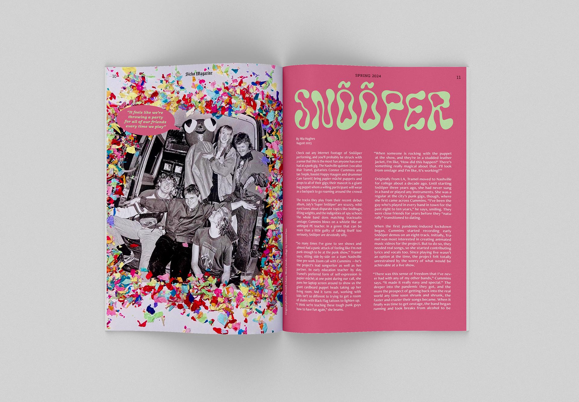
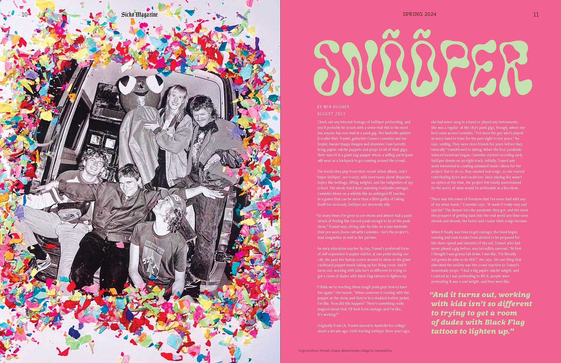
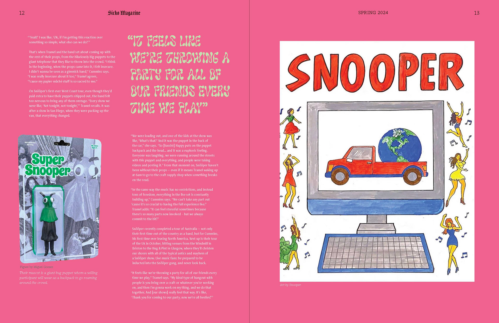
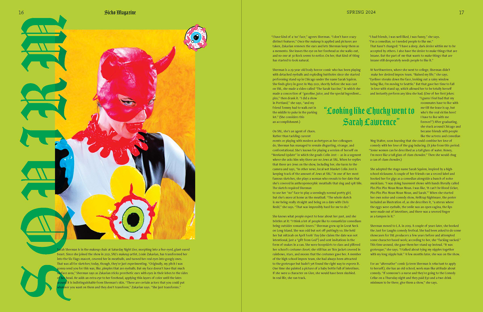
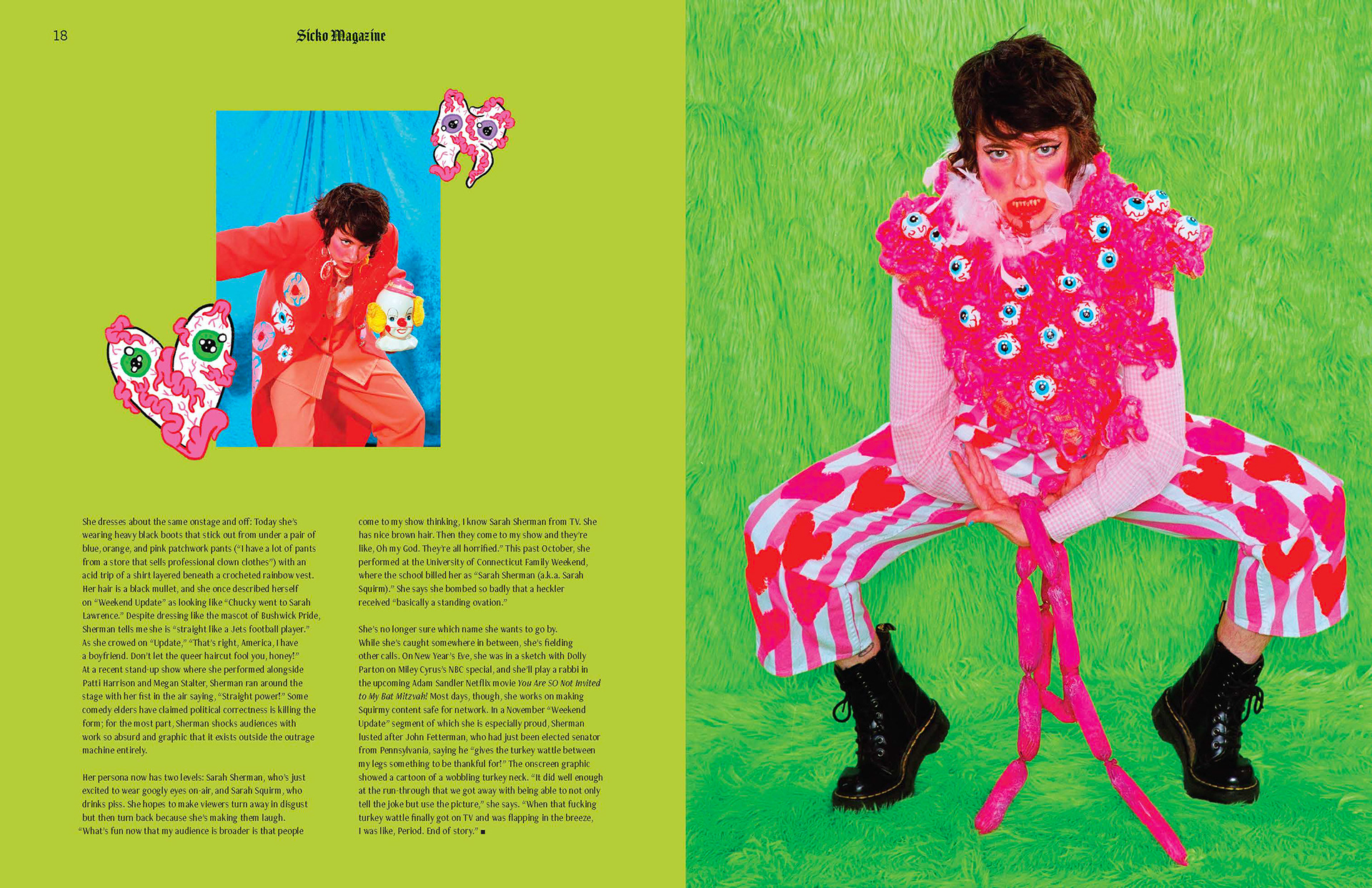
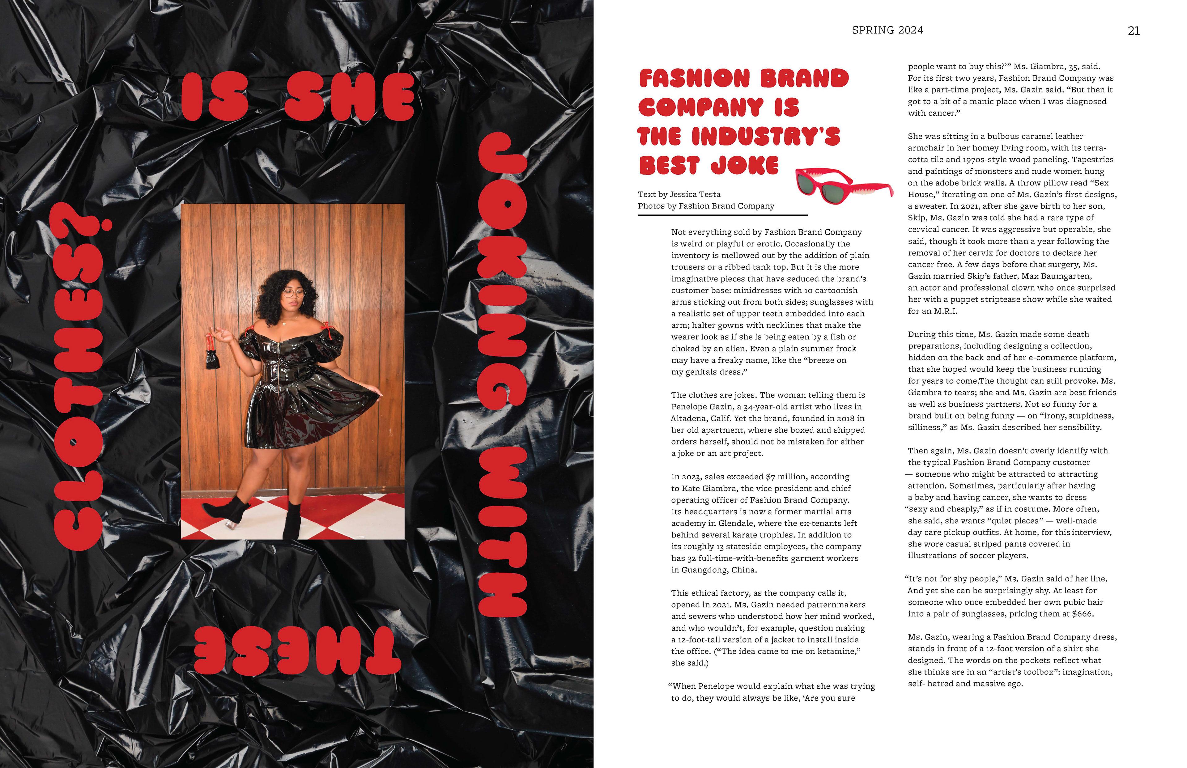
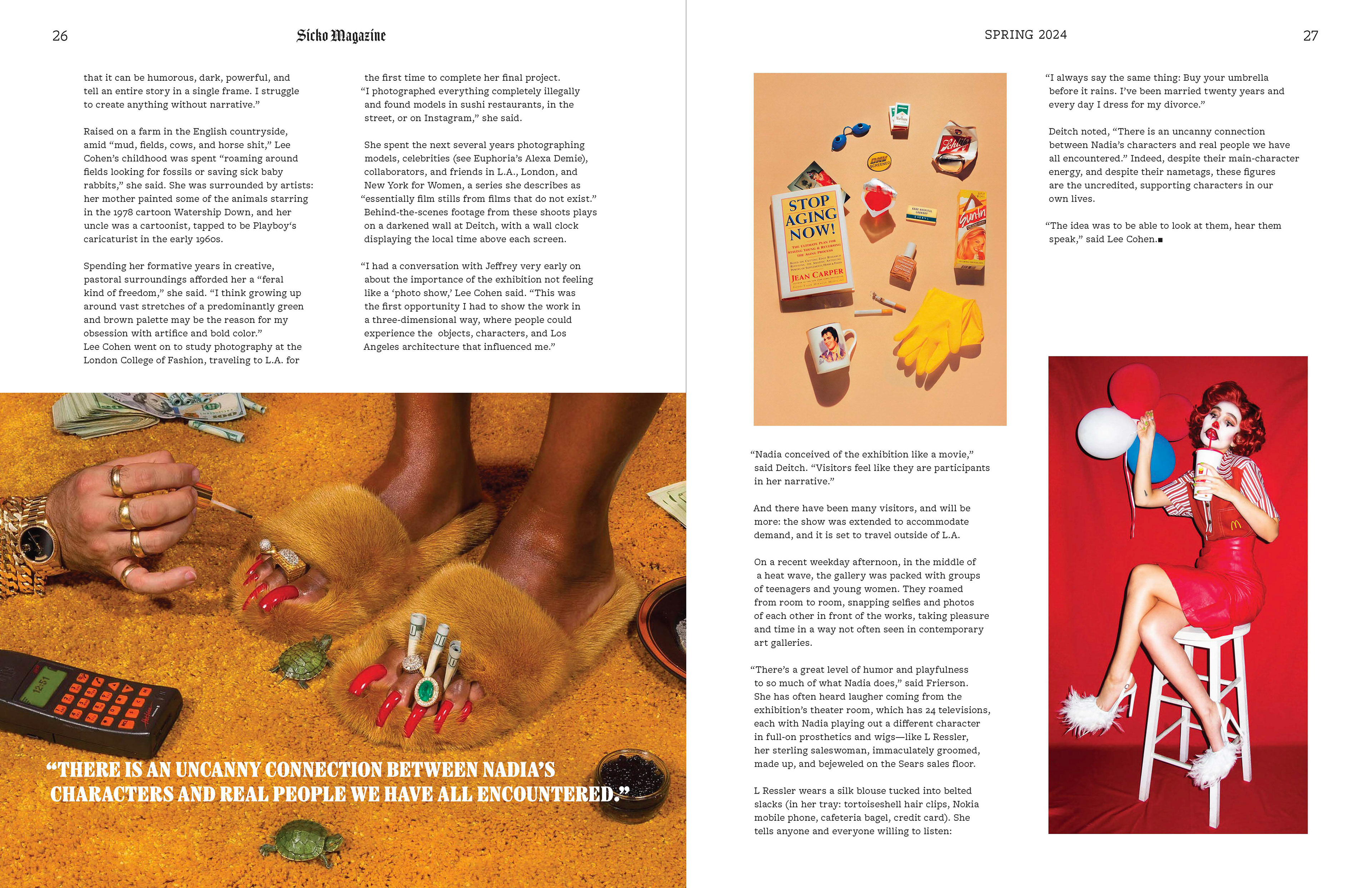
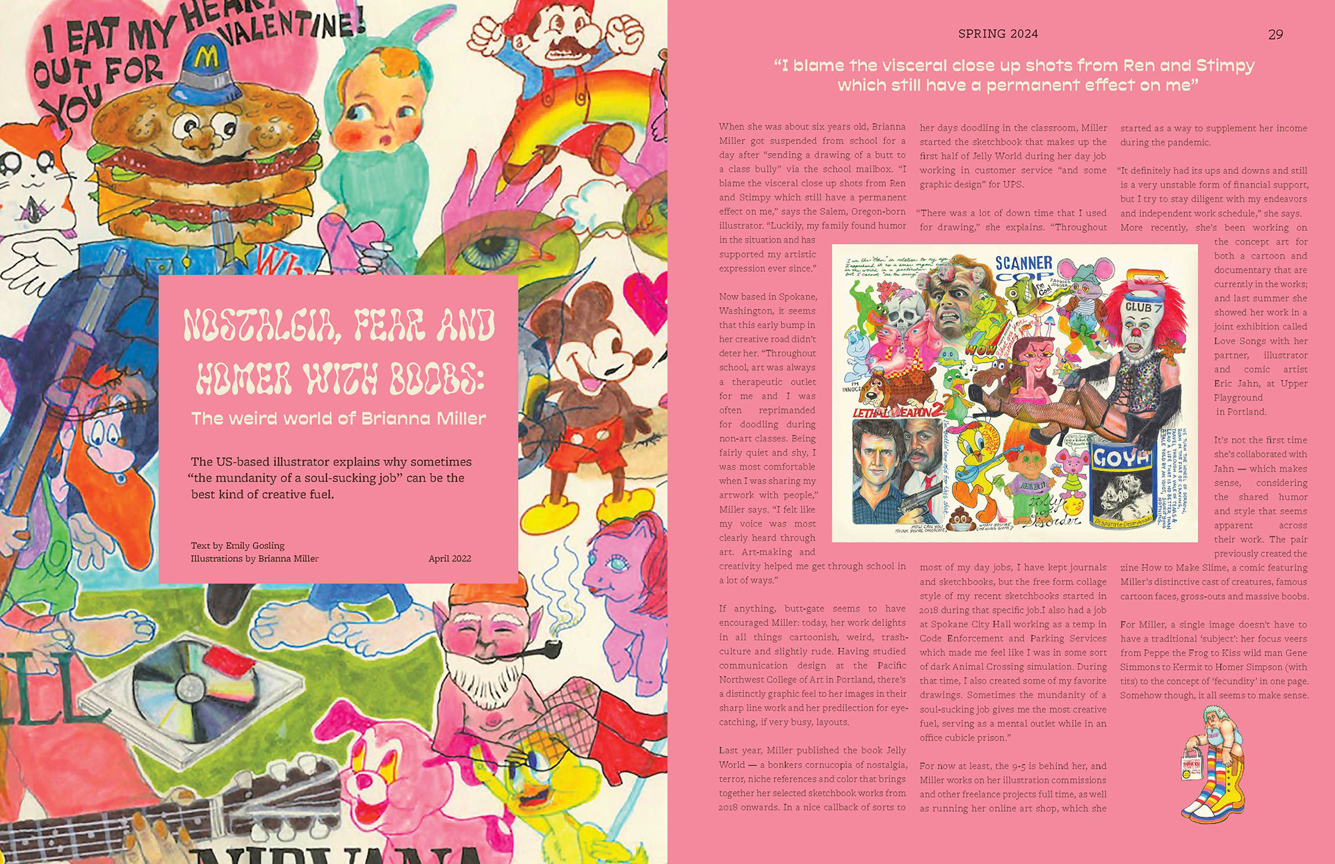
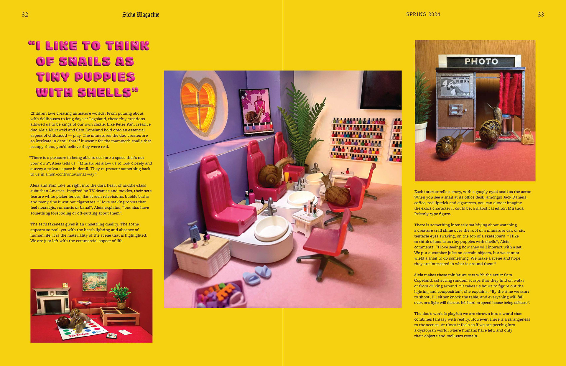
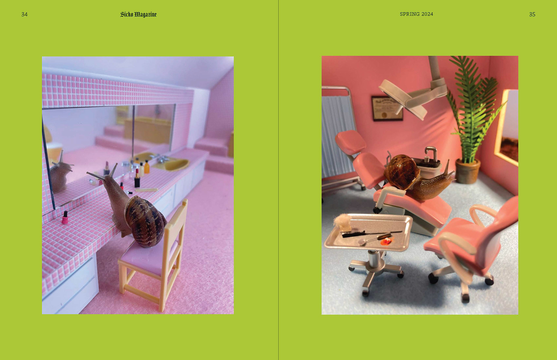
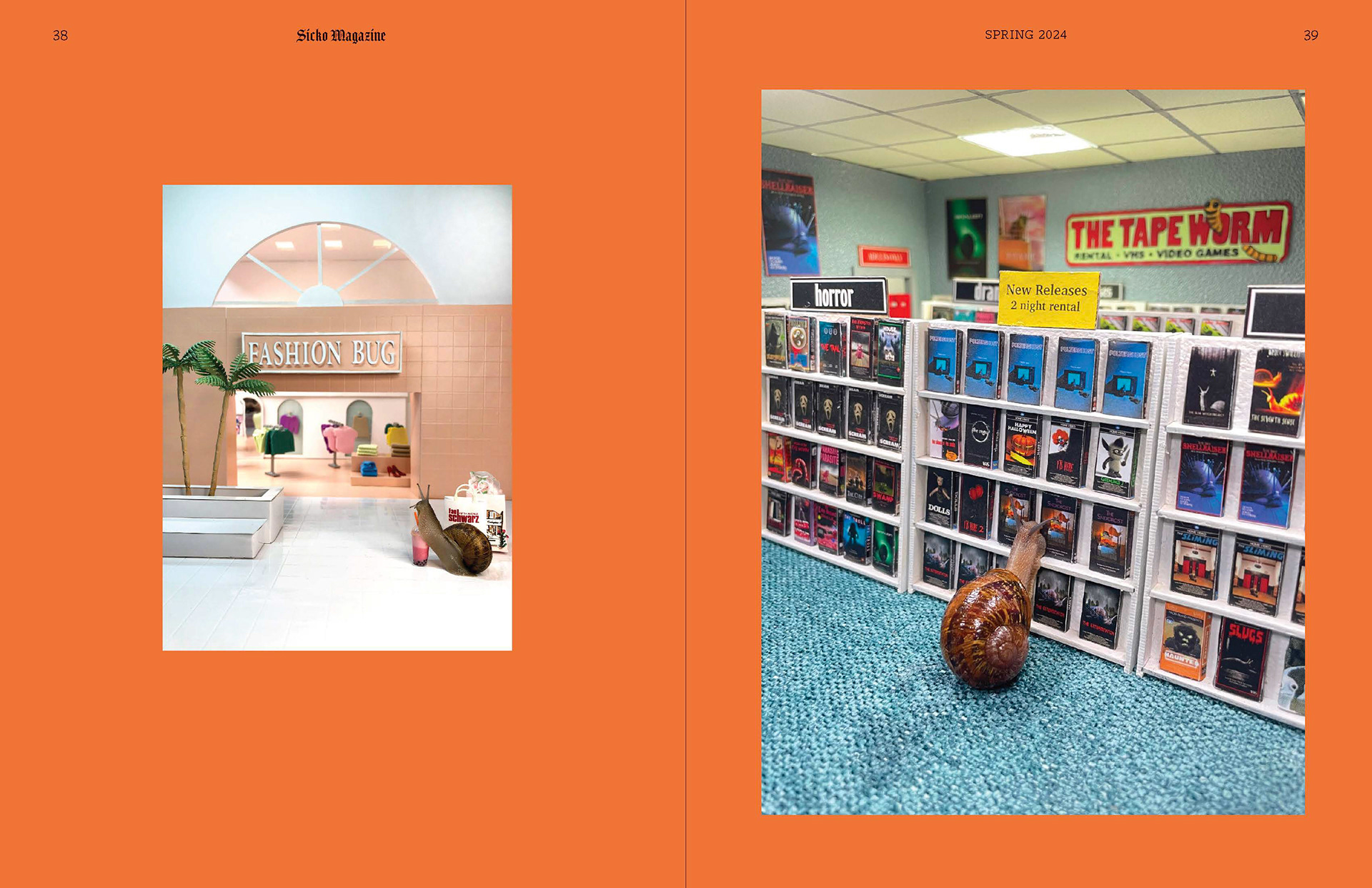
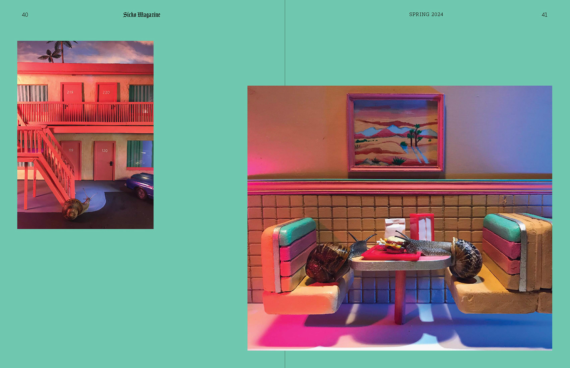
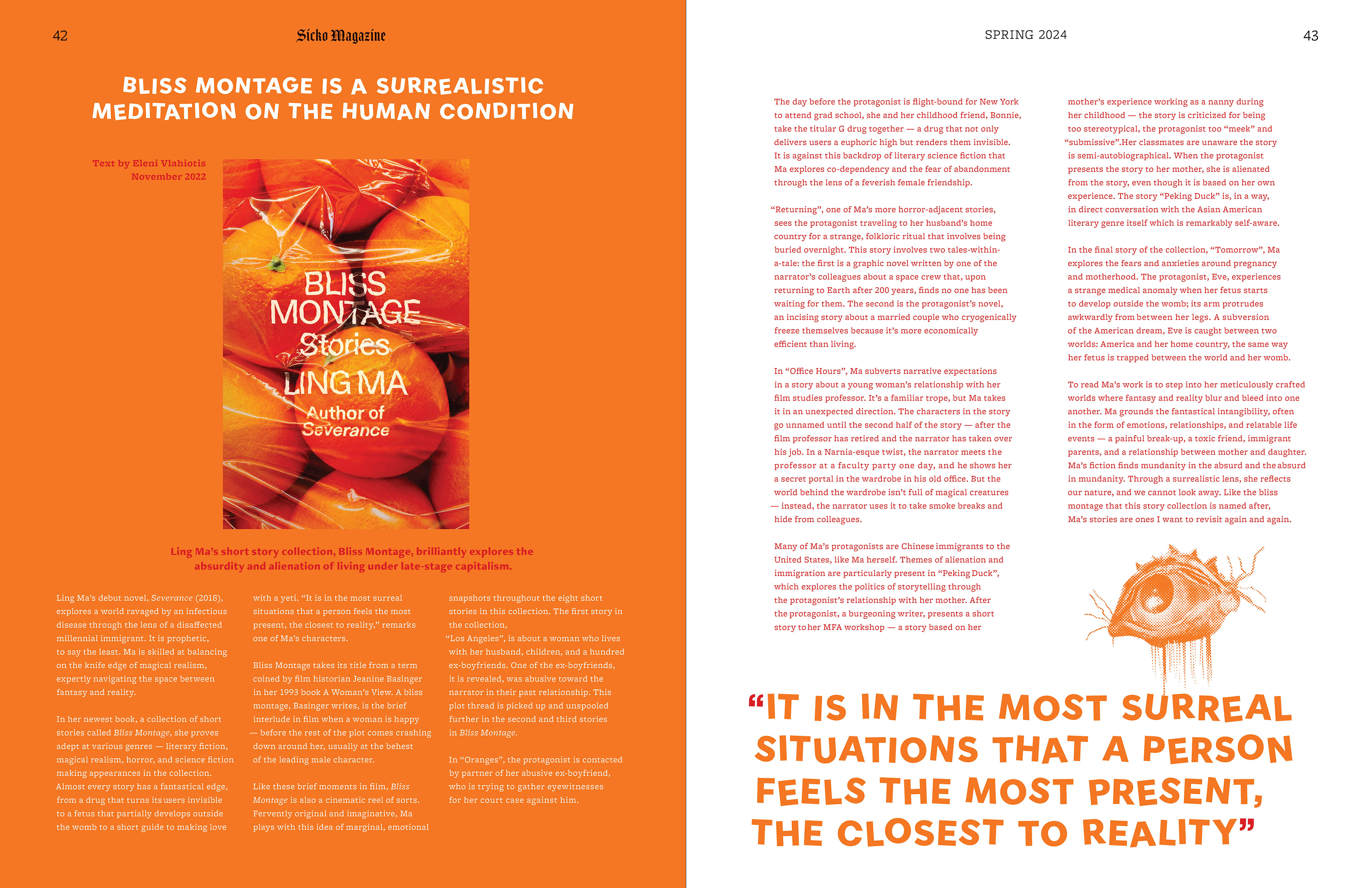
Sicko Magazine celebrates surrealism, irreverence, and absurdity in the arts; with a focus on music, literature, and visual & performance. Issue one features spotlights on comedian Sarah Squirm, multimedia artist Nadia Cohen, egg punk band Snooper, and a snail-centric photo essay from Aleia Murawski.
Sicko is for the freaks. The refined wackos. The peculiar & proud.
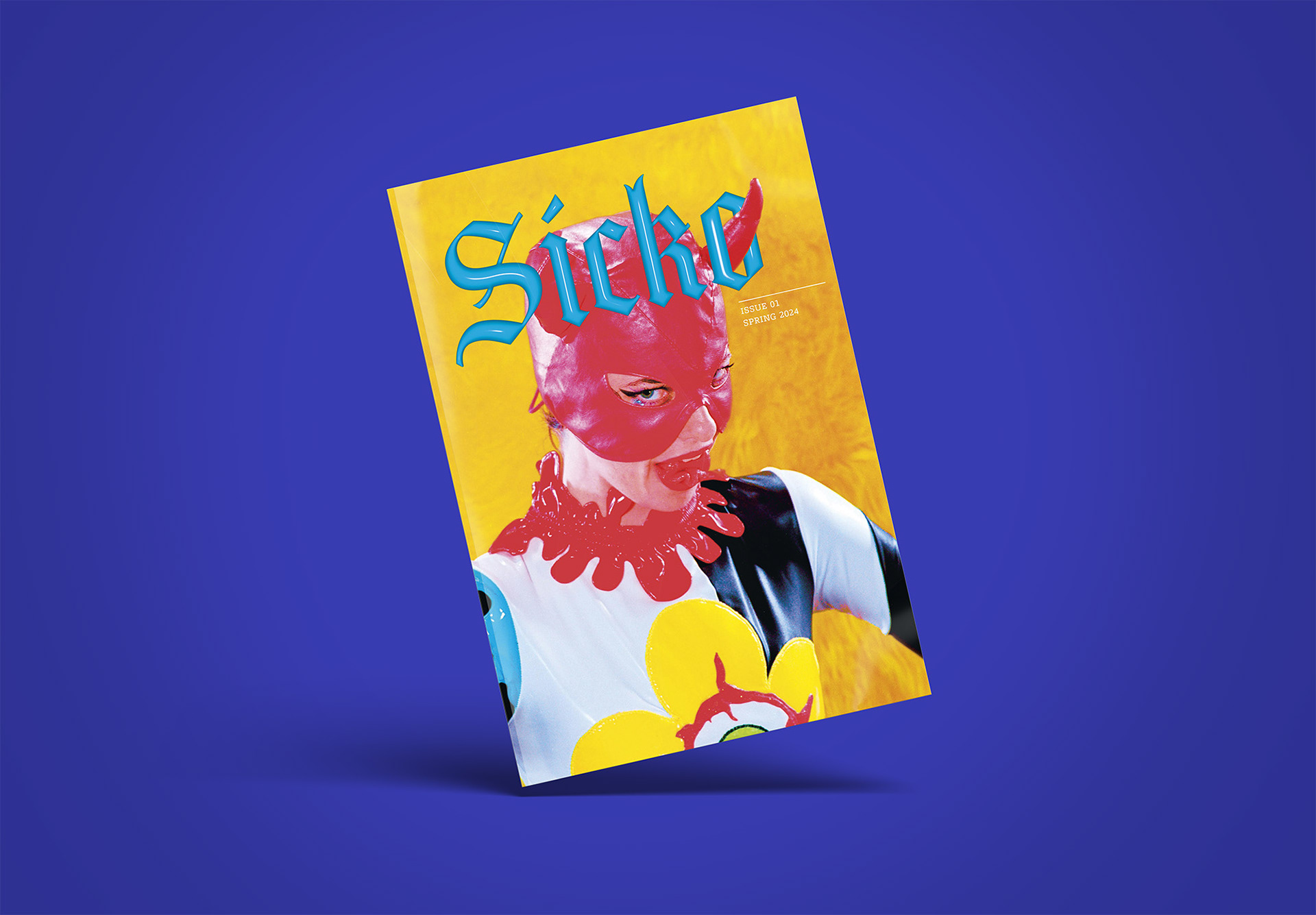
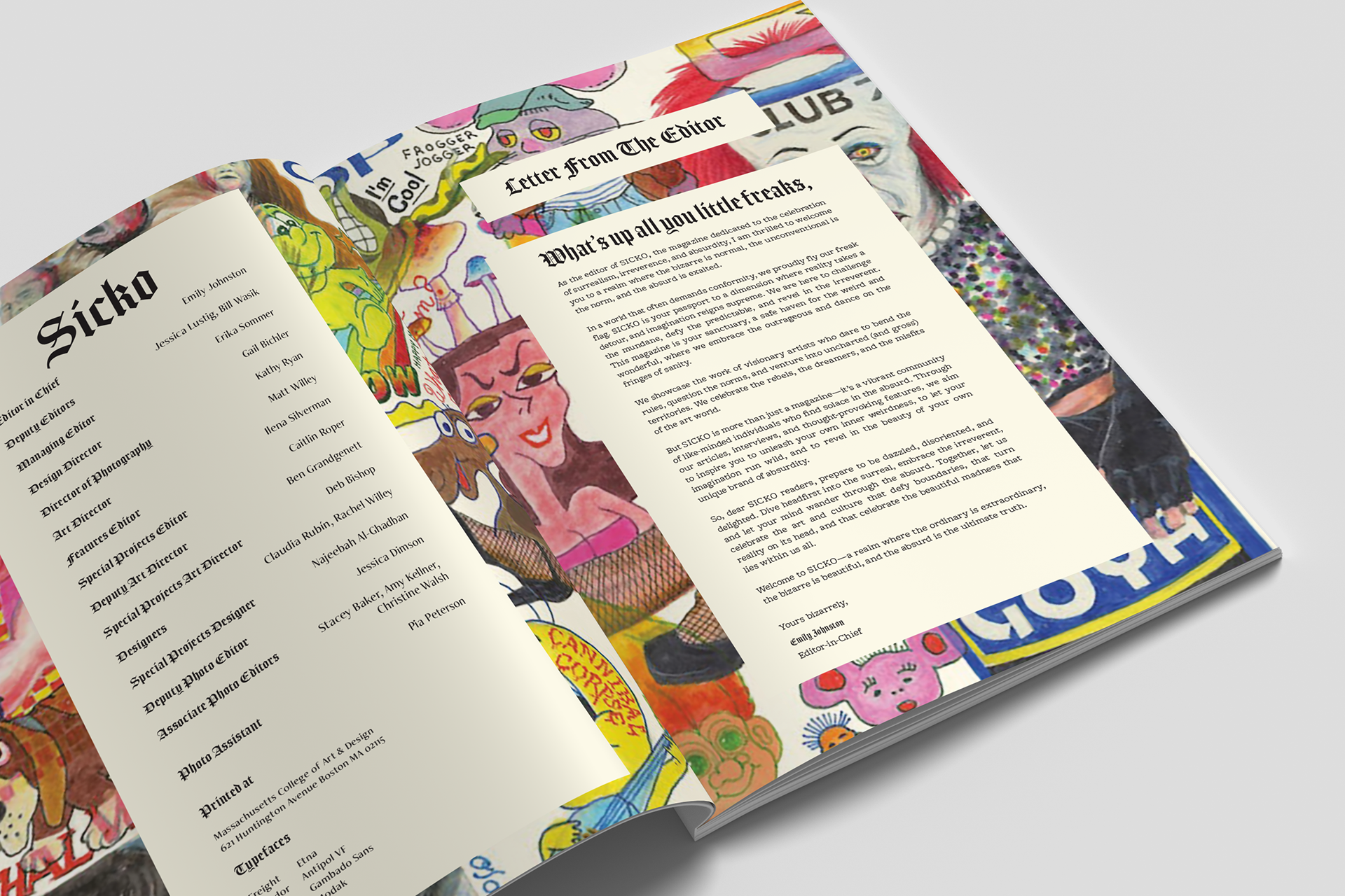
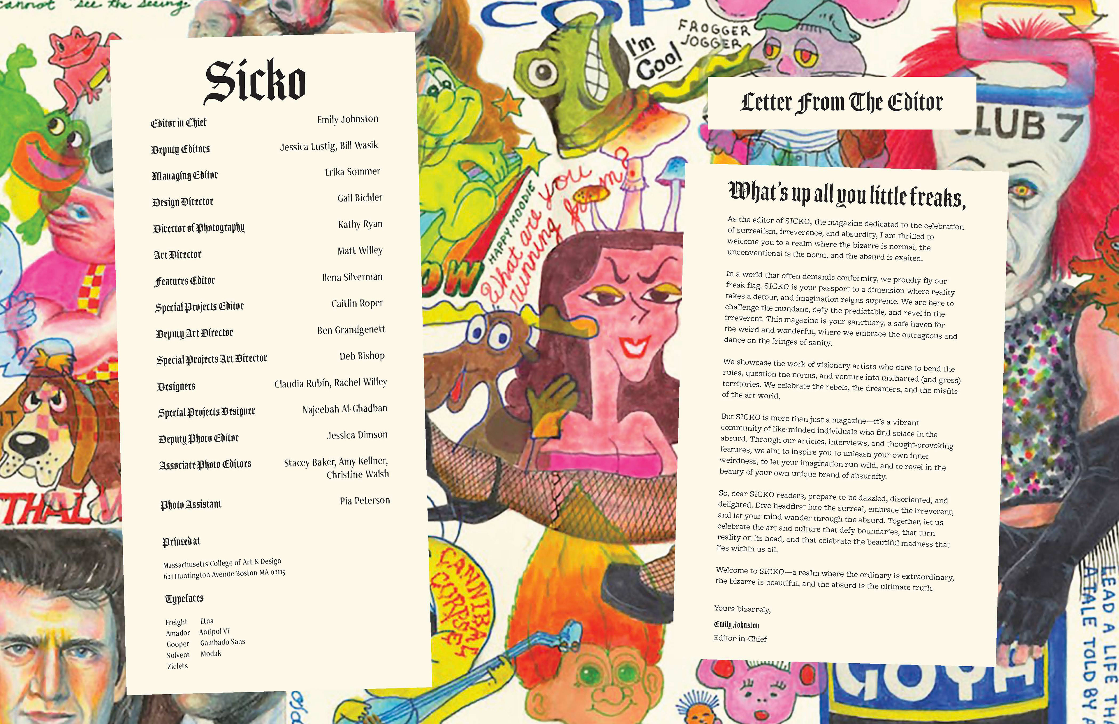
Sicko Magazine has a typographic logo utilizing Jim Parkinson's Amador typeface (2004). This typeface was inspired by the Arts & Crafts movement's homage to medieval practice and design. Sicko Magazine and the Arts & Craft movement share an ethos of skepticism regarding capitalism and the support of a society of independent artisans, similar to what existed in the Middle Ages. Sicko uses this past era's aesthetic while implementing a modern, inflated, plastic facade.
Full Magazine Spreads


Website Preview:
When designing the digital magazine, the continued use of unconventional & unexpected design allows the reader to have a playful engagement with the contents. Video, gifs, and motion graphics deliver an add depth and new perspectives to the featured articles.
Sicko's case study website is just as fun and interactive as the publication. Here you can explore my process in designing the digital magazine.